Welcome to our official publication of the Prometheus ETF Portfolio. Our primary takeaways for last week are as follows:
- Markets moved to price-tightening liquidity conditions last week.
- Treasuries rose last week as economic growth came in marginally weaker. However, this weakness was far from consistent with the degree of weakness required to elicit the four interest rate cuts priced into the market. Growth factors will likely continue to weigh on Treasuries.
- Our systems are moving to position the Prometheus ETF Portfolio to benefit from resilient nominal growth next week.
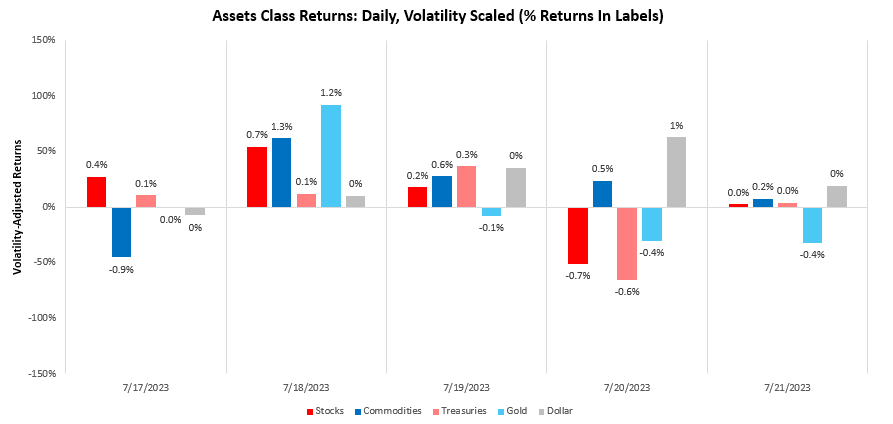
Over the last week, our systems moved to price-tightening liquidity, with Dollar rising by 1.16%. We show the daily path of returns through the week:
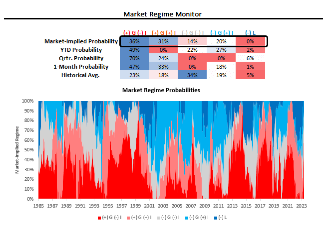
Using our understanding of cross-asset market pricing, we can derive the market-implied odds of varying regimes of growth, inflation, and liquidity. Currently, our proprietary process suggests that we are in a period of (+) G (-) I. We show our market regime monitor below:
Within this bigger picture, treasuries performed well last week as economic growth data showed weakness in industrial production and housing data. We think it is important to contextualize this price action since performance since our ETF portfolio was caught offside shorting treasuries.
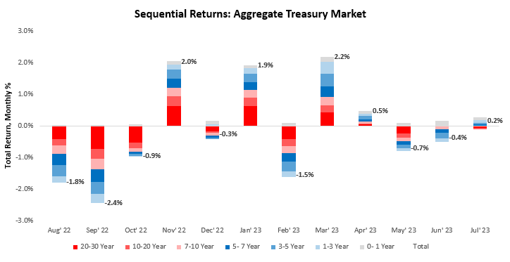
Over July, treasury markets rose by 0.17%. Over the last year, our aggregate treasury markets have returned -1.41%. Below, we show the sequential evolution of returns:
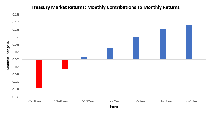
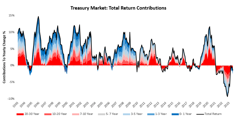
For a more granular understanding of the most recent months’ returns, we perform an attribution of total returns coming from various maturities of nominal treasuries across the yield curve. Over July, treasury markets were largely positive, with 0- 1 Year treasuries contributing the most to strength, while 20-30 Year treasuries contributed the most to weakness. We show this below:
To offer a bigger-picture view, we zoom out to show how aggregate treasury market returns have evolved over the last year and through history. As we can see below, over the last year, our aggregate treasury markets have returned -1.41%. The strongest component of the treasury market has been the 0- 1 Year tenors, and the weakest component has been the 20-30 Year treasuries.
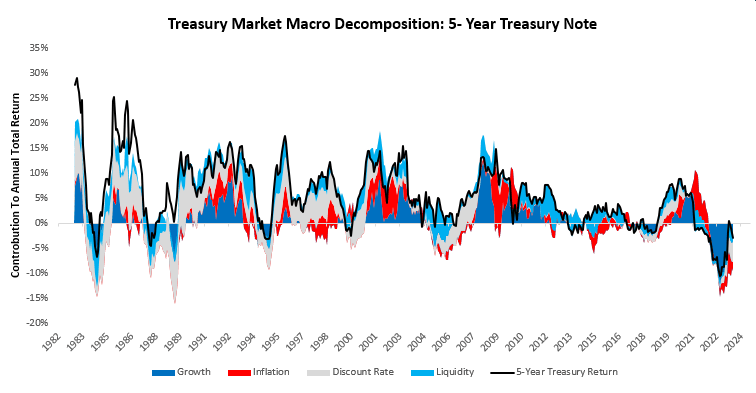
To help better understand these moves in treasury markets, we decompose these returns into their constituent macroeconomic drivers. Our estimate of the weighted average maturity of outstanding treasuries is six years, making the 5-year note the best proxy to assess the impact of macroeconomic forces on the treasury market. Over the last year, growth, inflation, and liquidity have contributed-8.22%, 3.22%, and 1.9% to total treasury returns.
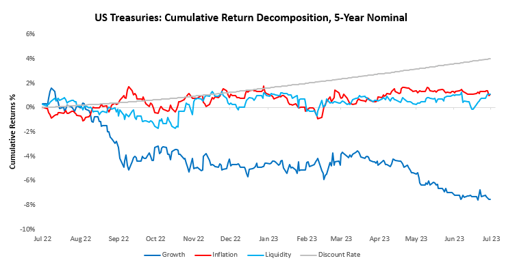
For a closer look at the current dynamic, we show the contributions to cumulative returns over the last coming from our macroeconomic factors. Please note the sum of the various factors equals the total return on the 5-year note:
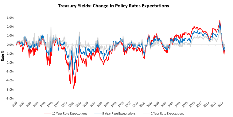
While our macroeconomic perspective is essential for us to understand what’s going on under the surface, mathematically, the single biggest factor that impacts nominal bonds is changes in discount rate expectations. Over the last month, short-term interest rate markets have remained unchanged. Over the last year, these markets have moved to price expectations of interest rate cuts. We show the evolution of these expectations below:
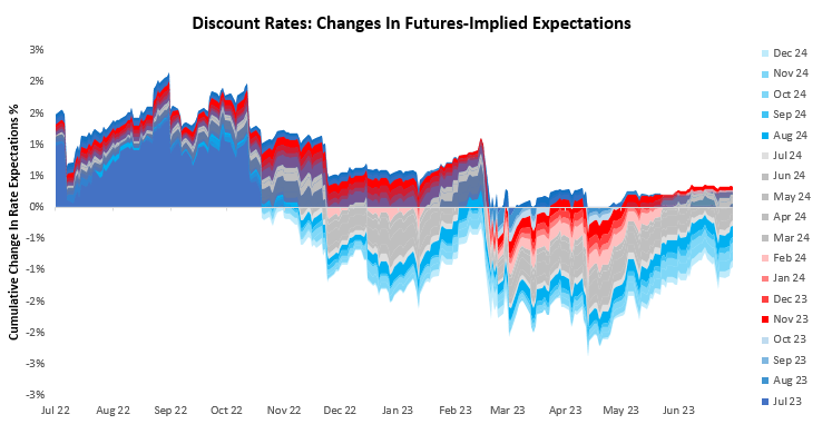
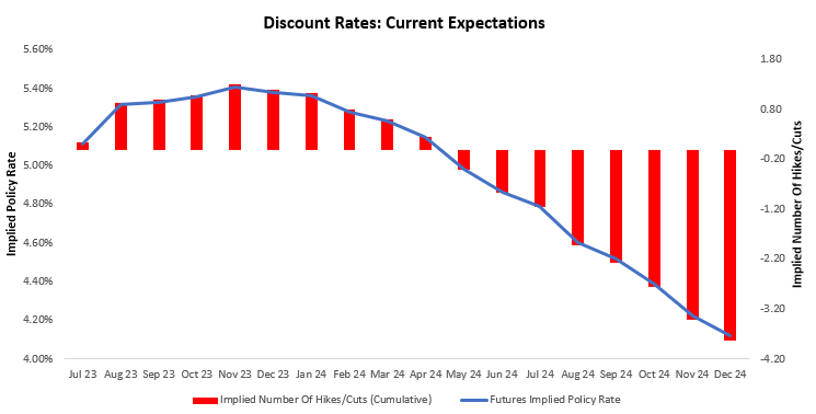
To better contextualize these recent changes in policy expectations, we show the latest discount rate path priced over the next eighteen months. Short-term interest rate markets are expecting a peak in policy rates on Nov 23 at 5.41%, followed by a trough on Dec 24 at 4.12%. This implies approximately four interest rate cuts cumulatively over the next eighteen months. We show this path below:
For further insight into what markets are pricing for the expected policy path, we show market expectations for discount rates priced across the yield curve. Currently, 10-year notes are pricing 2 cuts, 5-year notes are pricing 1 cut, and 2-year notes are pricing 0 hikes.
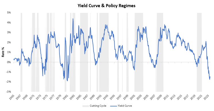
Finally, we turn to the yield curve to help contextualize where we are in the monetary policy cycle. Yield curves are useful in helping us understand equilibrium and how far we are from equilibrium conditions, as long-duration assets should, over time, command a yield premium over short-duration assets. Extreme deviations from these equilibrium conditions increase the potential for mean reversion over long periods. Currently, the yield curve is inverted and suggests eventual policy easing.
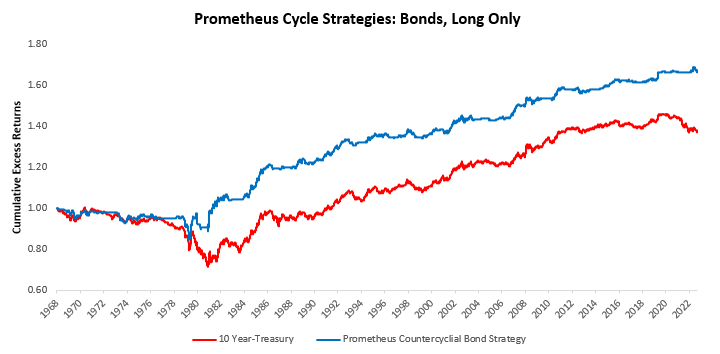
 Now, while the yield curve is inverted, which will likely be eventually resolved through a cutting cycle, there can be quite a long time before we get there. There will be a time to buy bonds in a levered fashion, and we have cycle strategies that will help us navigate this period. A sample is shown below:
However, we remain far from these conditions. In fact, conditions favor bond shorts more than long positions. Especially given recent trend factors.
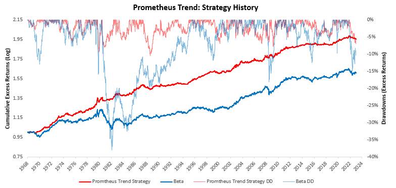
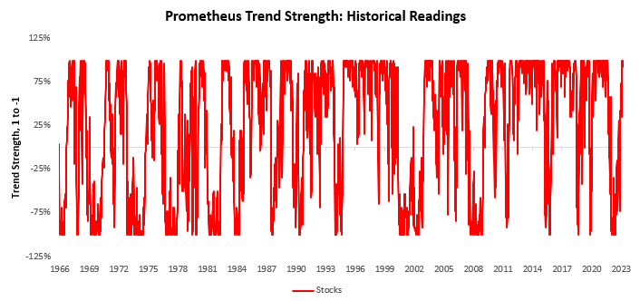
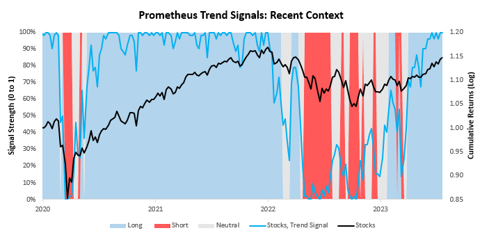
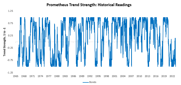
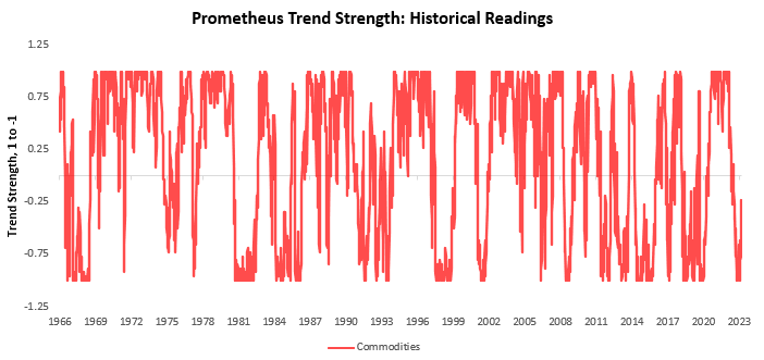
For context— we have developed a set of trend filters to help us better evaluate the sustainability of asset-class moves. As always, we have tested these trend measures over time to understand whether they can help reliably generate an edge in markets. As proof of concept, we show how these combined signals have performed relative to an underlying portfolio of the same four assets. Currently, these signals suggest long positions in stocks, short positions in bonds, flat positions in commodities, and long positions in gold.
We begin by showing our signals for stocks. We show both the full signal history and the most recent signal context:
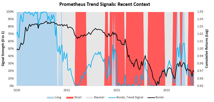
Next, we show our system’s current readings for 10-Year Treasuries:
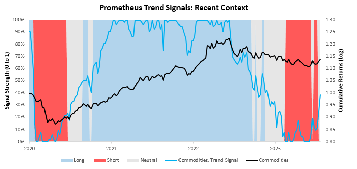
We now turn our attention to commodities:
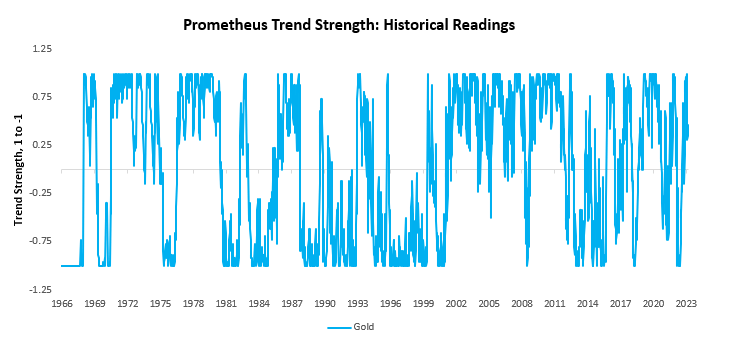
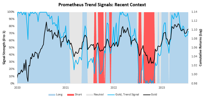
Finally, we show our trend signals for gold:
Overall, market pricing, along with economic data, remains more consistent with a decelerating economy with resilient inflationary pressures than one that is in the midst of contraction. This is important as while our expectations are for growth to continue to deteriorate, we simply aren’t there yet. We remain long nominal growth assets, with nimble risk management until markets and the data begin to tell us otherwise.
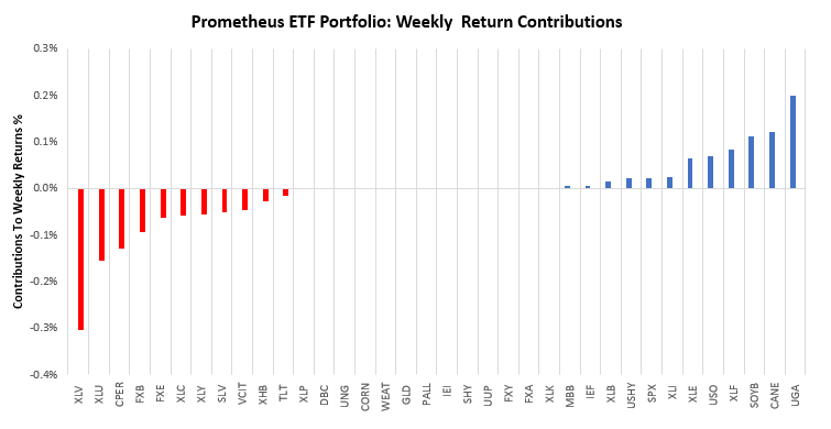
Within this context, our systems chose the right asset class exposure last week but suffered from security selection. Over the last week, the Prometheus ETF Portfolio was down by -0.26%. Below, we show the contributions to this portfolio performance across securities:
Turning to next week, our systems are looking to position the Prometheus ETF Portfolio as shown below. The portfolio contains 25 positions heading into next week. We show these below:
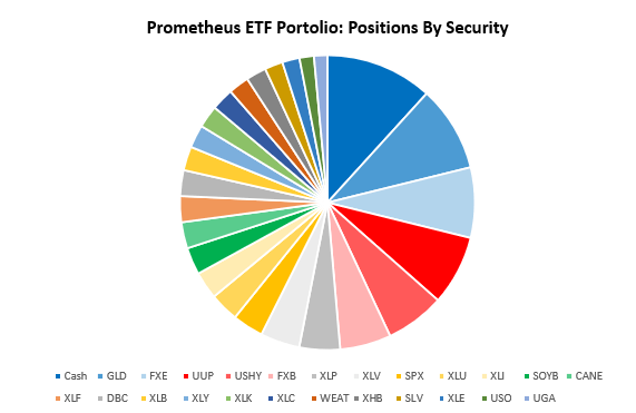
POSITIONS: Cash: -15.34% GLD : 12.29% FXE : 10.08% UUP : -10.01% USHY: 8.48% FXB : 7.33% XLP : 5.82% XLV : 5.65% SPX : 4.44% XLU : 4.18% XLI : 3.94% SOYB: 3.89% CANE: 3.76% XLF : 3.72% DBC : 3.7% XLB : 3.43% XLY : 3.29% XLK : 3.21% XLC : 3.19% WEAT: -2.95% XHB : 2.9% SLV : 2.6% XLE : 2.47% USO : 2.07% UGA : 1.92% . Please note if cash position is negative it implies leverage.
Additionally, we show these positions aggregated into asset class allocations below:
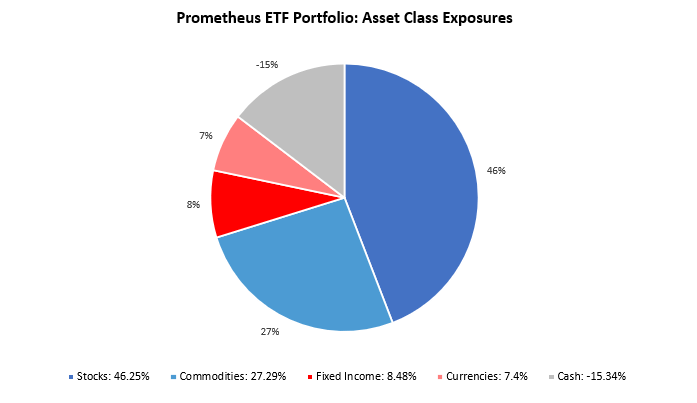
The portfolio has a net exposure (ex-cash) of 89.42%, with a gross exposure (ex-cash) of 115.34%. This allocation has an expected volatility of 13.36%, with a maximum expected volatility of 20%. Overall, while markets have moved to price recessionary conditions, the degree of pricing of these conditions in bond markets looks severe. Until we see material weakness in labor and income data, a consistent bond market bid looks unlikely. During this period, assets exposed to nominal growth and breakevens can outperform. We allocate accordingly.
Muchas gracias. ?Como puedo iniciar sesion?
get generic clomiphene online cost of clomid no prescription cost cheap clomiphene without insurance cheap clomiphene pills clomid pills get clomid pills can you get clomid pills
This is a theme which is in to my fundamentals… Diverse thanks! Unerringly where can I lay one’s hands on the connection details for questions?
This is the tolerant of delivery I unearth helpful.
zithromax without prescription – zithromax 500mg generic order flagyl generic
buy generic rybelsus for sale – buy semaglutide 14mg cheap cyproheptadine 4 mg
order domperidone 10mg sale – brand flexeril cyclobenzaprine sale
order inderal 20mg generic – methotrexate 5mg price how to buy methotrexate
amoxil online – buy valsartan 80mg for sale generic ipratropium 100mcg